Colourful Kitchens this summer
If you’re thinking of whether or not to update your colour home’s colour scheme this summer, the kitchen can be a good place to introduce vivid colours and interesting designs - both on the walls and furniture. Especially if you have a kitchen designed in Scandinavian or minimalist style. Bold colours will add warmth, dynamics, and energy to an arrangement and delicate pastels will complete the stark space. But which should you try?
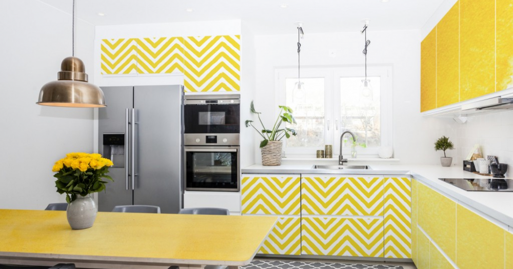
Yellow, lemon, honey-coloured
Yellow is a colour that is taking the world by storm and replacing pink, which has been fashionable for several years. Screaming ‘Look at Me’, Yellow is bold and vivid. When you use it on a larger surface, the kitchen will become bright and optimistic, yet it is equally nice being introduced in small elements such as a cabinet, table, or even dining wear.
Ultra Violet, or violet with a touch of blue
Ultra Violet is the colour of the year 2018, announced by the Pantone Institute, the global colour specialists. Violet is mysterious, mystical and spiritual. It gives the space an artistic and creative character. As it is a strong and definite colour, it is good to use on smaller spaces - a wall that is naturally illuminated, or several kitchen cabinet doors.
Oriental blue
Blue is a cool, calm and collected colour. If vivid colours are not your favourite, choose blue, turquoise or cobalt to create a calm space in your kitchen. You can use very light shades on one of the walls to enlarge the room or use darker blue variants on kitchen furniture elements to cool a room with lots of sun.
Pastel pink
Pink is a fresh and joyful colour, most often associated with femininity blending well with wood and the colour white. Small amounts of this colour will bring a touch of fun and sweetness to our kitchen. It's also a good colour for those of you who are ready for delicate changes in the appearance of your kitchen and are afraid to experiment with bold colours.
Green mint
Green is a soothing colour of nature – of grass, leaves, herbs, vegetables, and fruits. Bright and brisk shades, such as lime or peas, will give the kitchen an energetic and cheerful atmosphere. In turn, lighter and more subdued colours, like mint or olive, bring peace and work well on larger surfaces. Green is a safe colour for the kitchen space, it complements white colour, wooden or steel elements. It also goes well with fresh herbs kept in pots on the kitchen windowsill.
For more inspirations visit Pixers.